Visual Brand System for a Faculty Exhibition
The Department of Art & Design at the University of Minnesota Duluth (UMD) was preparing for their 2014–2015 faculty exhibition. Organizers needed a powerful poster that could convey the exhibition’s theme, What We Do, while using a system of social media content.

The Backstory
The poster design was a collaboration between Professor David Short and myself. We both were new faculty members in our first fall semester at UMD, and were excited to collaborate on this challenge and showcase our graphic design skills.

The Approach and Challenge
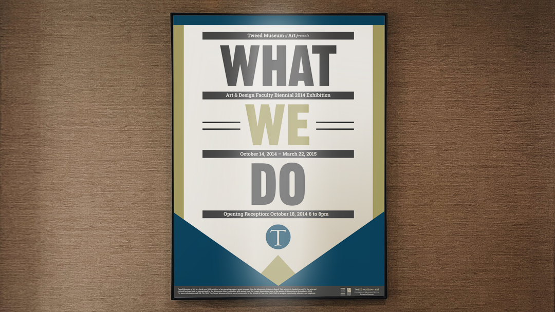
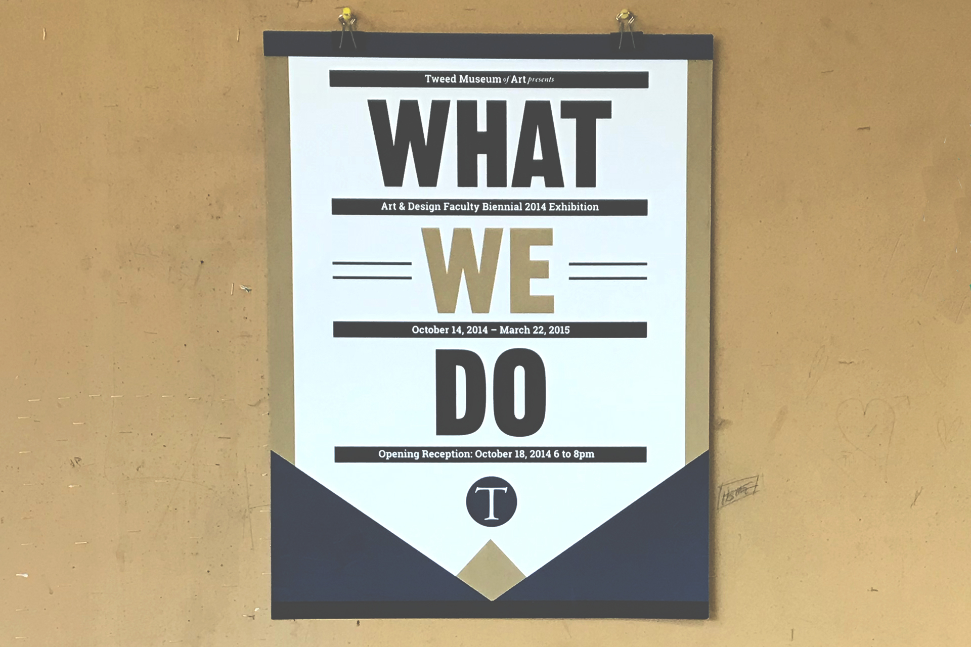
Conveying what each faculty member does with their creative practice was challenging because they work in various art and design disciplines and specialize in different mediums. A typographic solution was designed instead of relying on imagery to symbolize the faculty’s creative works.
The poster conveys the concept that the art of making things is deep-rooted in how the city of Duluth emerged from the time when machinery was analog. The color theme and wood-type style typefaces reflect that concept by referring to Duluth’s historical and industrial characteristics. With this direction, the typesetting and formatting gave the system character and made it visually recognizable.
The Development of the Visual System
When developing our strategy, social media gave us advantages over posters in meeting the objectives. Social media enabled us to target an audience, send event invites directly to people, and use analytics tools. However, poster-based content would not display similarly on digital media. As a result, we needed a visual brand system that used time-based media. Historically, social media posts with time-based media have more views and engagement than static social media content. Animations were a crucial component in building the exhibition’s system.
The Selection of the Typefaces
The exhibition’s theme, What We Do, influenced the selection of the Gothic and Roboto Slab typefaces and was an essential part of the system. Each typeface reflects Duluth’s industrial characteristics and history. Many of the old warehouses, plants and factories in the city have similar typefaces for their signage. The typefaces also conveyed the faculty’s hands-on mentality with their creative practice.
The Speech Rhythm
The speech rhythm of how someone would verbally say, What We Do, informed how we typeset and formatted the symmetrical layout for the poster.
The speech rhythm also influenced how the content from the poster can be animated for social media and other digital applications. The sequential order of the words What We Do appearing in the composition one at a time mimics the fluency of how someone may verbally speak the title of the exhibition.
The speech rhythm and fluency gave the social media personality.
A Sense of Immediacy
The Instagram posts for the exhibition were animated because social media analytic researchers have found that video content across all platforms receives the most views and likes. The post was animated to have a sense of immediacy because people have so many other posts in their Instagram feed trying to grab attention. The animation gave people a reason to read the exhibition’s information.
